


逐步迁移到 Jetpack Compose:保留 Fragment,替换详情页的内容
原作:Google Android Developers 课程与文档贡献者(页面无个人署名);译写整理:未完纪。根据 Migrating to Jetpack Compose 全文整理,2026-10-09 核对。原文文档采用 CC BY 4.0,代码示例采用 Apache 2.0;随稿 Apache 2.0 完整许可文本。译写与原创示意图采用 CC BY 4.0。Java 是 Oracle 和/或其关联公司的注册商标。
已有 Android 应用可以逐步引入 Compose。这个 Codelab 以 Sunflower 的植物详情页为例:继续保留 Fragment 导航、数据仓库和 ViewModel,把页面正文从 XML Views 迁移为 Compose;遇到仍适合用 View 实现的内容,则再从 Compose 中嵌入 View。文章需要读者具备 Kotlin(包括 lambda)和 Compose 基础。
选择迁移顺序
Compose 从设计之初就考虑了与 View 的互操作。原文建议三步推进:新屏幕优先用 Compose;在开发中识别公共组件,逐步积累可复用组件库;再按屏幕替换已有功能。
使用 Fragment 导航时,新屏幕可以仍是一个 Fragment,只把内容换成 Compose。也可以在旧页面中引入一小块 Compose,例如 RecyclerView 的新条目类型。迁移存量界面时,欢迎页、确认页、设置页等元素少、动态行为少的屏幕较容易起步;已经混用两套 UI 的页面,则可以从现有 Compose 子树向外扩展。这个自下而上的做法,让迁移跟随产品开发节奏推进。
取得练习项目,确认版本
原文提供 codelab-android-compose 仓库,其中的 MigrationCodelab 是 Codelab 的练习项目。原文的 main 分支是起点,end 分支是答案;引用原始 Sunflower 旧界面时使用它的 views 分支,因为 Sunflower 主分支本身已经部分迁移。
git clone https://github.com/android/codelab-android-compose
# 在 Android Studio 中打开仓库内的 MigrationCodelab 项目。
# 原文用于对照最终答案的命令:
git checkout end
上述命令会克隆仓库并将工作副本切换到答案分支。对自己的工作副本,在切换分支前先保存本地改动。练习仓库的分支是移动引用;复现时应记录提交、Android Studio、JDK、Gradle、AGP 和 Kotlin 版本。
项目已配置 Compose。核对时,网页展示 Java 17、buildFeatures { compose true },以及 androidx.compose:compose-bom:2026.09.00。下面保留原文依赖结构,不把它当作适配任意旧工程的独立升级方案:
android {
    compileOptions {
        sourceCompatibility JavaVersion.VERSION_17
        targetCompatibility JavaVersion.VERSION_17
    }
    buildFeatures {
        compose true
    }
}
dependencies {
    def composeBom = platform('androidx.compose:compose-bom:2026.09.00')
    implementation(composeBom)
    androidTestImplementation(composeBom)
    implementation "androidx.compose.runtime:runtime"
    implementation "androidx.compose.ui:ui"
    implementation "androidx.compose.foundation:foundation"
    implementation "androidx.compose.foundation:foundation-layout"
    implementation "androidx.compose.material3:material3"
    implementation "androidx.compose.runtime:runtime-livedata"
    implementation "androidx.compose.ui:ui-tooling-preview"
    debugImplementation "androidx.compose.ui:ui-tooling"
}版本说明:这是网页中的 Groovy DSL 片段,不是完整 Gradle 文件。Compose 编译器、Kotlin 插件与 AGP 的兼容配置仍以选定练习提交和对应文档为准。本文不声称仅加入这些行就能把任意已有项目编译通过。
在旧 View 树中放入 ComposeView
详情页的外层结构保持不变。在 fragment_plant_detail.xml 中,原本 NestedScrollView 内是一个 ConstraintLayout 和四个 TextView。迁移这块子树时,移除或妥善注释旧节点,再加入一个具有唯一 ID 的 ComposeView:
<androidx.core.widget.NestedScrollView
    android:id="@+id/plant_detail_scrollview"
    android:layout_width="match_parent"
    android:layout_height="match_parent"
    android:clipToPadding="false"
    android:paddingBottom="@dimen/fab_bottom_padding"
    app:layout_behavior="@string/appbar_scrolling_view_behavior">

    <androidx.compose.ui.platform.ComposeView
        android:id="@+id/compose_view"
        android:layout_width="match_parent"
        android:layout_height="match_parent" />
</androidx.core.widget.NestedScrollView>
这是嵌入原 XML 的片段,根节点仍需保留项目原有的命名空间。原文展示的注释含排版用破折号,不能直接当作有效 XML 注释;此处去掉被删除的布局与排版注释,只保留迁移后的结构。
ComposeView 是一个普通 Android View,通过 setContent 承载 Composition。最小可见内容可以是:
@Composable
fun PlantDetailDescription() {
    Surface {
        Text("Hello Compose")
    }
}
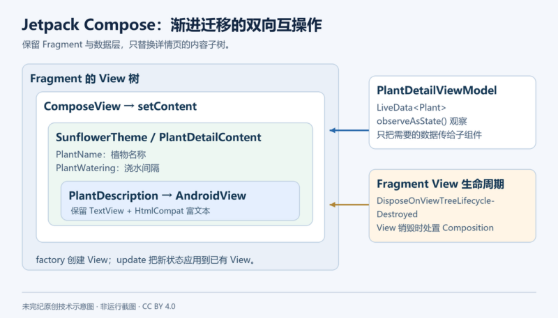
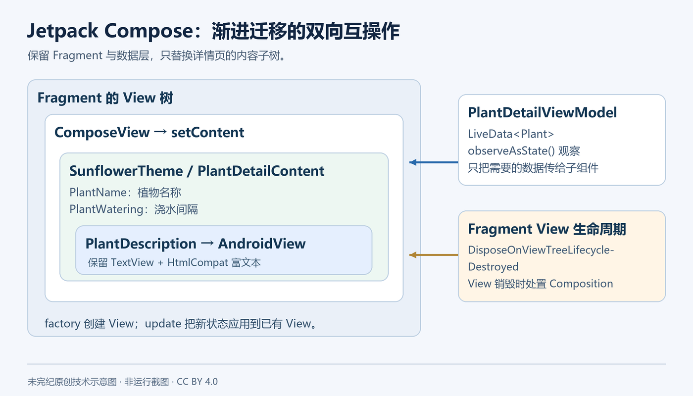
Sunflower 使用 Data Binding,因此 Fragment 能直接取得 binding.composeView。初始练习先在 setContent 内调用 MaterialTheme { PlantDetailDescription() }。下面给出最终需要保留的宿主配置,把源文稍后才引入的销毁策略一起放在这里,避免迁移中遗漏:
binding.composeView.apply {
    setViewCompositionStrategy(
        ViewCompositionStrategy.DisposeOnViewTreeLifecycleDestroyed
    )
    setContent {
        SunflowerTheme {
            PlantDetailDescription(plantDetailViewModel)
        }
    }
}
该片段放入原 Fragment 的布局初始化流程中;binding、plantDetailViewModel 与导航逻辑沿用练习项目。使用 androidx.compose.ui.platform.ViewCompositionStrategy。Composition 应跟随 Fragment 的 View 生命周期销毁,而不是只跟随 Fragment 对象的生命周期。
把植物名称从 XML 变为可组合函数
旧名称 TextView 使用 textAppearanceHeadline5,两侧各有 8 dp 资源边距,并水平居中。对应 Compose 代码如下:
@Composable
private fun PlantName(name: String) {
    Text(
        text = name,
        style = MaterialTheme.typography.headlineSmall,
        modifier = Modifier
            .fillMaxWidth()
            .padding(horizontal = dimensionResource(R.dimen.margin_small))
            .wrapContentWidth(Alignment.CenterHorizontally)
    )
}
fillMaxWidth 对应铺满可用宽度;padding 通过 dimensionResource 读取现有资源;wrapContentWidth 在占据的宽度中让内容居中。原文用 Material 3 的 headlineSmall 对应旧 headline 样式。迁移阶段继续以资源文件作为尺寸和文案的来源,能够减少两套界面不一致。
@Preview
@Composable
private fun PlantNamePreview() {
    SunflowerTheme {
        PlantName("Apple")
    }
}
预览适合快速检查布局,不能替代在设备上验证导航、状态恢复和无障碍行为。这里最终使用自定义 SunflowerTheme,对应原文主题步骤完成后的状态。
在屏幕入口观察 LiveData,把数据传给子组件
Fragment 已持有 PlantDetailViewModel。可在屏幕级 composable 中接受它;底层 UI 组件只接受真正需要的值,不必知道 ViewModel 或数据仓库。
@Composable
fun PlantDetailDescription(plantDetailViewModel: PlantDetailViewModel) {
    val plant by plantDetailViewModel.plant.observeAsState()
    plant?.let {
        PlantDetailContent(it)
    }
}
observeAsState() 把 LiveData 的值表示为 Compose State。当 LiveData 发布新值时,读取该状态的 UI 会重新组合。由于值可能为空,源文用空值判断,只在对象存在时显示正文。真实应用若需要加载或错误状态,应在屏幕级明确表达这些状态。
ViewModel 的实例由宿主和作用域管理,不是每个 composable 自动获得一个独立实例。这里复用 Fragment 已持有的实例,以保持原数据层行为。
迁移浇水信息,复用文案和尺寸资源
旧布局的浇水信息有两行:带强调色的加粗标题,以及由浇水间隔生成的复数文案。迁移时可在 Column 中复用同一组 Modifier:
@Composable
private fun PlantWatering(wateringInterval: Int) {
    Column(Modifier.fillMaxWidth()) {
        val centered = Modifier
            .padding(horizontal = dimensionResource(R.dimen.margin_small))
            .align(Alignment.CenterHorizontally)
        val normalPadding = dimensionResource(R.dimen.margin_normal)

        Text(
            text = stringResource(R.string.watering_needs_prefix),
            color = MaterialTheme.colorScheme.primaryContainer,
            fontWeight = FontWeight.Bold,
            modifier = centered.padding(top = normalPadding)
        )
        Text(
            text = pluralStringResource(
                R.plurals.watering_needs_suffix,
                wateringInterval,
                wateringInterval
            ),
            modifier = centered.padding(bottom = normalPadding)
        )
    }
}
pluralStringResource 的第二个参数负责选择复数形式,后续参数用于格式化文案。Modifier 是普通 Kotlin 对象,可以保存在局部变量中复用。此处的 align 在 Column 的作用域中使用,不能无条件移动到任意外部函数。
与源文差异:源页仍写着“Compose 1.2.1 中需要 @OptIn(ExperimentalComposeUiApi::class)”。这是历史版本提示。本文的当前片段没有加入该旧注解;若复现历史提交,应以所选版本的 API 要求为准。源文还说明 colorAccent 没有完全一一对应的 Material 3 属性,primaryContainer 是本练习选择,后续通过主题配色对齐。
在 Compose 内继续使用 TextView
植物描述包含 HTML。旧 Binding Adapter 在 TextView 上调用 HtmlCompat.fromHtml。迁移保留这一能力,通过 AndroidView 将 View 嵌入 Compose:
@Composable
private fun PlantDescription(description: String) {
    val htmlDescription = remember(description) {
        HtmlCompat.fromHtml(description, HtmlCompat.FROM_HTML_MODE_COMPACT)
    }
    AndroidView(
        factory = { context ->
            TextView(context).apply {
                movementMethod = LinkMovementMethod.getInstance()
            }
        },
        update = { view ->
            view.text = htmlDescription
        }
    )
}
factory 负责创建和初始配置 TextView;update 把当前状态应用到已有 View。不要在每次重组时重新创建并替换整个对象。remember(description) 以描述字符串为键缓存解析结果,描述变化时才重新解析;状态变化使 UI 更新。
如果需要从 XML 布局创建 View,可使用 androidx.compose.ui:ui-viewbinding 提供的 AndroidViewBinding。本练习沿用 TextView 富文本路径;源文关于 Compose 当时不支持 HTML 的说明不应推广成所有后续版本的现状。
输入边界:这里是 TextView 的富文本解析,不是 WebView 执行 JavaScript。但设置 LinkMovementMethod 后,HTML 中的链接可以被点击。若描述改为外部不可信来源,应检查允许的 URL 协议、域名与打开策略;HtmlCompat.fromHtml 不能被当作完整的恶意链接过滤器。原文练习内容是项目植物数据,示例文本没有硬编码密钥;外部链接的协议、域名与打开策略仍需按应用边界明确设置。
把三块 UI 组合起来,同时保留原布局 16 dp 的整体资源边距:
@Composable
fun PlantDetailContent(plant: Plant) {
    Surface {
        Column(Modifier.padding(dimensionResource(R.dimen.margin_normal))) {
            PlantName(plant.name)
            PlantWatering(plant.wateringInterval)
            PlantDescription(plant.description)
        }
    }
}

@Preview
@Composable
private fun PlantDetailContentPreview() {
    val plant = Plant("id", "Apple", "HTML<br><br>description", 3, 30, "")
    SunflowerTheme {
        PlantDetailContent(plant)
    }
}
为什么需要 ViewCompositionStrategy
原文说明了直接依赖 ComposeView 从窗口分离时销毁 Composition 的问题:Fragment 转场期间 View 可能暂时 detached,但界面仍然可见;View 类型的状态保存也需要符合 Fragment View 的生命周期。
因此,前面的宿主片段明确使用 DisposeOnViewTreeLifecycleDestroyed。它在对应 View 树的 LifecycleOwner 销毁时处置 Composition。不同 Compose 版本的默认策略可能演进,不能把旧文中的默认行为描述当作永久契约;对 Fragment 中的 ComposeView,显式选择适合 View 生命周期的策略更清楚。
让 Compose 使用 Sunflower 的主题
默认 MaterialTheme 并不知道旧 View 主题的绿色、黄色和暗色背景。原文在 theme/Theme.kt 定义 SunflowerTheme,从资源中建立两套 Material 3 配色:
@Composable
fun SunflowerTheme(
    darkTheme: Boolean = isSystemInDarkTheme(),
    content: @Composable () -> Unit
) {
    val lightColors = lightColorScheme(
        primary = colorResource(R.color.sunflower_green_500),
        primaryContainer = colorResource(R.color.sunflower_green_700),
        secondary = colorResource(R.color.sunflower_yellow_500),
        background = colorResource(R.color.sunflower_green_500),
        onPrimary = colorResource(R.color.sunflower_black),
        onSecondary = colorResource(R.color.sunflower_black)
    )
    val darkColors = darkColorScheme(
        primary = colorResource(R.color.sunflower_green_100),
        primaryContainer = colorResource(R.color.sunflower_green_200),
        secondary = colorResource(R.color.sunflower_yellow_300),
        onPrimary = colorResource(R.color.sunflower_black),
        onSecondary = colorResource(R.color.sunflower_black),
        onBackground = colorResource(R.color.sunflower_black),
        surface = colorResource(R.color.sunflower_green_100_8pc_over_surface),
        onSurface = colorResource(R.color.sunflower_white)
    )
    MaterialTheme(
        colorScheme = if (darkTheme) darkColors else lightColors,
        content = content
    )
}
以上是原文选择的颜色映射,不是对所有界面都成立的对比度保证。把 Fragment 和各个预览中的 MaterialTheme 换成 SunflowerTheme,再加入暗色预览:
@Preview(uiMode = Configuration.UI_MODE_NIGHT_YES)
@Composable
private fun PlantDetailContentDarkPreview() {
    val plant = Plant("id", "Apple", "HTML<br><br>description", 3, 30, "")
    SunflowerTheme {
        PlantDetailContent(plant)
    }
}
MaterialTheme 也可定制 typography 和 shapes。本文只覆盖 Codelab 中的颜色迁移;真实页面还应检查深浅模式的文字对比度、长文本、字体缩放、滚动、焦点和可访问性,不能仅凭预览相似就判定行为没有回归。
把混合页面的测试一起迁移
原 androidTest 下的 PlantDetailFragmentTest 包含植物名称测试和分享 Intent 测试。名称已不再由旧 TextView 呈现,因此只按 View ID 查找它的断言需要改用 Compose 语义节点。
将原 ActivityScenarioRule 换为 createAndroidComposeRule<GardenActivity>(),同时仍可通过它的 activityRule 访问 Activity 场景。以下是原文测试结构的相关片段,数据库填充、其余测试和项目 imports 保留在原文件中:
@RunWith(AndroidJUnit4::class)
class PlantDetailFragmentTest {
    @Rule
    @JvmField
    val composeTestRule = createAndroidComposeRule<GardenActivity>()

    @Before
    fun jumpToPlantDetailFragment() {
        populateDatabase()
        composeTestRule.activityRule.scenario.onActivity { gardenActivity ->
            activity = gardenActivity
            val bundle = Bundle().apply {
                putString("plantId", "malus-pumila")
            }
            findNavController(activity, R.id.nav_host)
                .navigate(R.id.plant_detail_fragment, bundle)
        }
    }

    @Test
    fun testPlantName() {
        composeTestRule.onNodeWithText("Apple").assertIsDisplayed()
    }
}
分享按钮仍在原 View 结构中,其 Intent 断言应继续覆盖原行为。源文报告其练习环境中的调整后测试可以通过;这是该环境的测试结果,不保证任意版本组合都能构建通过。生产迁移应在已有回归测试保护下逐步进行,并验证旋转、返回栈和 View 销毁重建。
迁移到这里,哪些内容仍在原系统中
这次练习替换的是植物详情的文本内容子树,不是整个应用架构。Fragment 导航、原数据层和外层滚动/工具栏布局仍保留。原文还指向 Sunflower 的 compose 分支,展示完整详情页迁移,包括图片加载、动画、CollapsingToolbarLayout 行为模拟和更完整的尺寸处理。这些属于后续练习,本文不把它们写成已经完成。
本文覆盖源文从迁移策略到测试的完整流程;将重复的中间态合并为最终结构,修正 XML 注释排版,并补充版本适配与链接输入边界。示例属于迁移指导,不保证任意项目版本组合可以直接编译;实际应用仍需针对数据来源、生命周期和可访问性验证。








暂无评论内容