


说明:本文末尾提供完整示例代码的下载链接。
使用 Matplotlib 绘图方法,最基本的方式是将坐标作为数值型 NumPy 数组传入。例如,当 x 和 y 都是浮点数或整数的 NumPy 数组时,plot(x, y) 就能工作。如果 numpy.asarray 能把它们转换为浮点数组,绘图方法同样可以使用;例如,x 可以是一个 Python 列表。
对于存在“单位转换器”的其他数据类型,Matplotlib 也能执行转换。它内置两种转换器,一种用于日期,另一种用于字符串列表。其他下游库还可以为自己的数据类型提供转换器。
如何向 Matplotlib 添加转换器,见 matplotlib.units。下面简要介绍内置的日期和字符串转换器。
日期转换
如果 x 和/或 y 是 datetime 列表或 numpy.datetime64 数组,Matplotlib 的内置转换器会将日期时间转换为浮点数,并为坐标轴添加适合日期的刻度定位器和格式化器。详见 matplotlib.dates。
下面的示例会为 x 轴配置转换器,将 numpy.datetime64 转为浮点数;配置定位器,在每月月初放置刻度;并配置格式化器,为刻度添加合适的日期标签。
import numpy as np

import matplotlib.dates as mdates
import matplotlib.units as munits

import matplotlib.pyplot as plt

fig, ax = plt.subplots(figsize=(5.4, 2), layout='constrained')
time = np.arange('1980-01-01', '1980-06-25', dtype='datetime64[D]')
x = np.arange(len(time))
ax.plot(time, x)
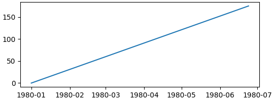
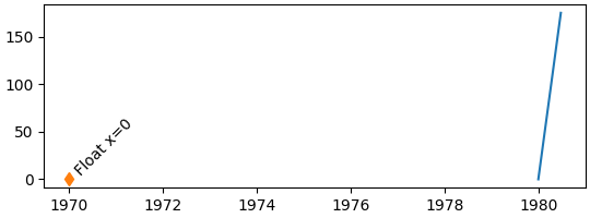
注意,如果尝试在 x 轴上绘制浮点数,该数值会被解释为相对于转换器“纪元”的天数,这里的纪元是 1970-01-01,详见 Matplotlib 日期格式。因此,绘制值 0 时,刻度会从 1970-01-01 开始;定位器也改为每两年显示一个刻度,而不再按月显示。
fig, ax = plt.subplots(figsize=(5.4, 2), layout='constrained')
time = np.arange('1980-01-01', '1980-06-25', dtype='datetime64[D]')
x = np.arange(len(time))
ax.plot(time, x)
# 0 gets labeled as 1970-01-01
ax.plot(0, 0, 'd')
ax.text(0, 0, ' Float x=0', rotation=45)
可以自定义定位器和格式化器。完整列表见 日期刻度定位器 与 日期格式化器,使用示例见 日期刻度定位器和格式化器示例。下面每隔两个月定位一次,并用 %b 将标签格式化为三字母月份名;格式代码见 strftime。
fig, ax = plt.subplots(figsize=(5.4, 2), layout='constrained')
time = np.arange('1980-01-01', '1980-06-25', dtype='datetime64[D]')
x = np.arange(len(time))
ax.plot(time, x)
ax.xaxis.set_major_locator(mdates.MonthLocator(bymonth=np.arange(1, 13, 2)))
ax.xaxis.set_major_formatter(mdates.DateFormatter('%b'))
ax.set_xlabel('1980')
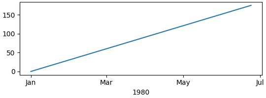
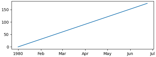
默认定位器为 AutoDateLocator,默认格式化器为 AutoDateFormatter。另外还有更紧凑的“concise”格式化器和定位器,可以通过 rcParams 设置。注意,年初原本重复的“Jan”标签改成了“1980”。更多例子见 使用 ConciseDateFormatter 格式化日期刻度。
plt.rcParams['date.converter'] = 'concise'

fig, ax = plt.subplots(figsize=(5.4, 2), layout='constrained')
time = np.arange('1980-01-01', '1980-06-25', dtype='datetime64[D]')
x = np.arange(len(time))
ax.plot(time, x)
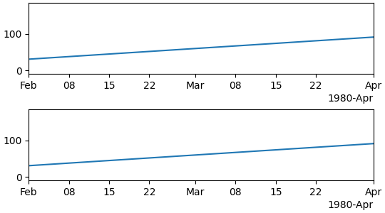
设置坐标轴范围时,可以传入适当的日期,也可以传入单位正确的浮点值,即纪元以来的天数。如有需要,可通过 date2num 获取这种数值。
fig, axs = plt.subplots(2, 1, figsize=(5.4, 3), layout='constrained')
for ax in axs.flat:
    time = np.arange('1980-01-01', '1980-06-25', dtype='datetime64[D]')
    x = np.arange(len(time))
    ax.plot(time, x)

# set xlim using datetime64:
axs[0].set_xlim(np.datetime64('1980-02-01'), np.datetime64('1980-04-01'))

# set xlim using floats:
# Note can get from mdates.date2num(np.datetime64('1980-02-01'))
axs[1].set_xlim(3683, 3683+60)
字符串转换:分类绘图
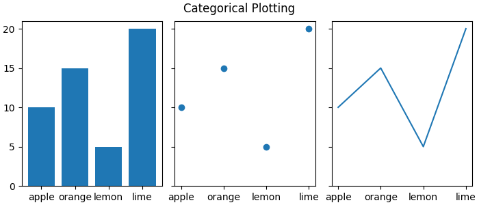
有时需要在坐标轴上标注类别而不是数字。Matplotlib 通过“分类”转换器支持这种用法,详见 category。
data = {'apple': 10, 'orange': 15, 'lemon': 5, 'lime': 20}
names = list(data.keys())
values = list(data.values())

fig, axs = plt.subplots(1, 3, figsize=(7, 3), sharey=True, layout='constrained')
axs[0].bar(names, values)
axs[1].scatter(names, values)
axs[2].plot(names, values)
fig.suptitle('Categorical Plotting')
类别按首次指定的顺序排列。后续即使用不同顺序绘制,也不会改变最初的排列;新添加的类别会追加在末尾,下面的 pear 就是一个例子。
fig, ax = plt.subplots(figsize=(5, 3), layout='constrained')
ax.bar(names, values)

# plot in a different order:
ax.scatter(['lemon', 'apple'], [7, 12])

# add a new category, "pear", and put the other categories in a different order:
ax.plot(['pear', 'orange', 'apple', 'lemon'], [13, 10, 7, 12], color='C1')
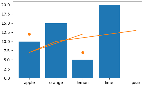
注意,像上面那样使用 plot 时,各绘图点会映射到数据最初确定的类别位置,因此新折线会按调用时指定的顺序连接。
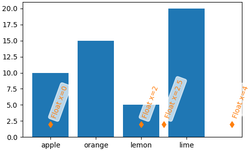
分类转换器将类别映射到从零开始的整数。因此,也可以用浮点数手动向坐标轴添加数据。如果传入的浮点数没有对应类别,数据点仍能画出来,但不会为它创建刻度。下面在 4.0 和 2.5 处绘制数据,却没有增加刻度,因为这些位置不对应类别。
fig, ax = plt.subplots(figsize=(5, 3), layout='constrained')
ax.bar(names, values)
# arguments for styling the labels below:
args = {'rotation': 70, 'color': 'C1',
        'bbox': {'color': 'white', 'alpha': .7, 'boxstyle': 'round'}}


# 0 gets labeled as "apple"
ax.plot(0, 2, 'd', color='C1')
ax.text(0, 3, 'Float x=0', **args)

# 2 gets labeled as "lemon"
ax.plot(2, 2, 'd', color='C1')
ax.text(2, 3, 'Float x=2', **args)

# 4 doesn't get a label
ax.plot(4, 2, 'd', color='C1')
ax.text(4, 3, 'Float x=4', **args)

# 2.5 doesn't get a label
ax.plot(2.5, 2, 'd', color='C1')
ax.text(2.5, 3, 'Float x=2.5', **args)
分类坐标轴的范围可以通过类别名称指定,也可以通过浮点数指定:
fig, axs = plt.subplots(2, 1, figsize=(5, 5), layout='constrained')
ax = axs[0]
ax.bar(names, values)
ax.set_xlim('orange', 'lemon')
ax.set_xlabel('limits set with categories')
ax = axs[1]
ax.bar(names, values)
ax.set_xlim(0.5, 2.5)
ax.set_xlabel('limits set with floats')
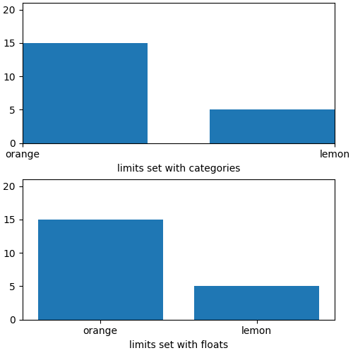
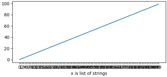
分类坐标轴对某些图形很有用,但如果把本来应为浮点数或日期的数据读成字符串列表,也可能造成困惑。读取逗号分隔值(CSV)文件时就可能遇到这种情况。分类定位器与格式化器会为每一个字符串值放置刻度,并分别添加标签。
fig, ax = plt.subplots(figsize=(5.4, 2.5), layout='constrained')
x = [str(xx) for xx in np.arange(100)]  # list of strings
ax.plot(x, np.arange(100))
ax.set_xlabel('x is list of strings')
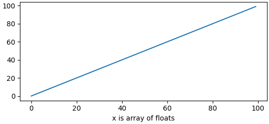
如果这不是预期结果,只需在绘图前将数据转换为浮点数:
fig, ax = plt.subplots(figsize=(5.4, 2.5), layout='constrained')
x = np.asarray(x, dtype='float')  # array of float.
ax.plot(x, np.arange(100))
ax.set_xlabel('x is array of floats')
确定坐标轴使用的转换器、格式化器和定位器
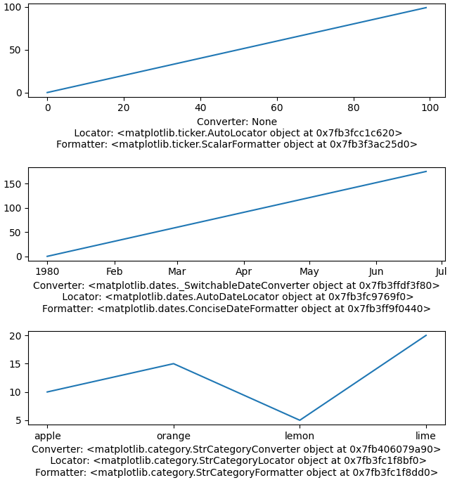
调试时,了解 Matplotlib 如何转换输入数据往往很有帮助。可以查询坐标轴的转换器属性,也可以通过 get_major_locator 和 get_major_formatter 查询定位器与格式化器。
注意,默认情况下转换器为 None。
fig, axs = plt.subplots(3, 1, figsize=(6.4, 7), layout='constrained')
x = np.arange(100)
ax = axs[0]
ax.plot(x, x)
label = f'Converter: {ax.xaxis.get_converter()}\n '
label += f'Locator: {ax.xaxis.get_major_locator()}\n'
label += f'Formatter: {ax.xaxis.get_major_formatter()}\n'
ax.set_xlabel(label)

ax = axs[1]
time = np.arange('1980-01-01', '1980-06-25', dtype='datetime64[D]')
x = np.arange(len(time))
ax.plot(time, x)
label = f'Converter: {ax.xaxis.get_converter()}\n '
label += f'Locator: {ax.xaxis.get_major_locator()}\n'
label += f'Formatter: {ax.xaxis.get_major_formatter()}\n'
ax.set_xlabel(label)

ax = axs[2]
data = {'apple': 10, 'orange': 15, 'lemon': 5, 'lime': 20}
names = list(data.keys())
values = list(data.values())
ax.plot(names, values)
label = f'Converter: {ax.xaxis.get_converter()}\n '
label += f'Locator: {ax.xaxis.get_major_locator()}\n'
label += f'Formatter: {ax.xaxis.get_major_formatter()}\n'
ax.set_xlabel(label)
进一步了解“单位”支持
日期与类别支持都属于 Matplotlib 内置的“单位”支持体系。相关说明见 matplotlib.units 与 基本单位示例。
单位支持会查询传给绘图函数的数据类型,然后分派给列表中第一个接受该类型的转换器。因此,如果 x 包含 datetime 对象,就会使用 _SwitchableDateConverter;如果包含字符串,就会交给 StrCategoryConverter。
for k, v in munits.registry.items():
    print(f"type: {k};\n    converter: {type(v)}")
type: <class 'decimal.Decimal'>;
    converter: <class 'matplotlib.units.DecimalConverter'>
type: <class 'numpy.datetime64'>;
    converter: <class 'matplotlib.dates._SwitchableDateConverter'>
type: <class 'datetime.date'>;
    converter: <class 'matplotlib.dates._SwitchableDateConverter'>
type: <class 'datetime.datetime'>;
    converter: <class 'matplotlib.dates._SwitchableDateConverter'>
type: <class 'str'>;
    converter: <class 'matplotlib.category.StrCategoryConverter'>
type: <class 'numpy.str_'>;
    converter: <class 'matplotlib.category.StrCategoryConverter'>
type: <class 'bytes'>;
    converter: <class 'matplotlib.category.StrCategoryConverter'>
type: <class 'numpy.bytes_'>;
    converter: <class 'matplotlib.category.StrCategoryConverter'>
许多下游库提供自己的转换器、定位器和格式化器。例如,astropy、pint 与 unyt 等库提供物理单位支持。
pandas 和 nc-time-axis 等高层库,以及因此使用相应支持的 xarray,提供自己的日期时间支持。这些支持有时与 Matplotlib 原生日期时间支持不兼容,因此使用这些库时,应谨慎搭配 Matplotlib 的定位器与格式化器。
原文记录的脚本总运行时间为 0 分 7.944 秒。
原文图库由 Sphinx-Gallery 生成。
原文:Plotting dates and strings。作者/维护者:Matplotlib 文档贡献者。本文为原文的中文译文;代码保留原文内容。











暂无评论内容