


本教程介绍 Matplotlib 的基本用法与实践建议。文末提供完整示例代码的下载链接。
import matplotlib.pyplot as plt
import numpy as np
一个简单的例子
Matplotlib 在 Figure 中绘制数据。Figure 可以显示为窗口、Jupyter 小部件等形式,每个 Figure 可以包含一个或多个 Axes。Axes 是绘制数据的区域,其中的点通常由 x-y 坐标指定;极坐标图使用 θ-r,三维图使用 x-y-z。
创建一个包含单个 Axes 的 Figure,最简单的方法是调用 pyplot.subplots。随后可以用 Axes.plot 绘制数据,再用 show 显示图形:
fig, ax = plt.subplots()             # Create a figure containing a single Axes.
ax.plot([1, 2, 3, 4], [1, 4, 2, 3])  # Plot some data on the Axes.
plt.show()                           # Show the figure.
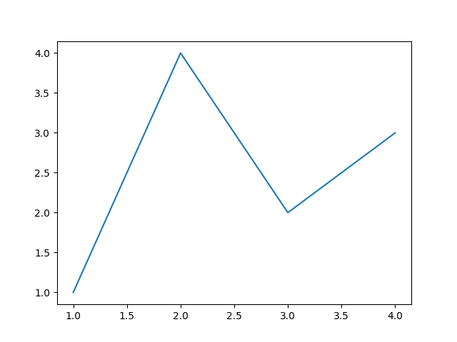
某些环境可以省略 plt.show(),例如 Jupyter notebook 会自动显示代码单元格创建的全部图形。
Figure 的组成
下面展示了 Matplotlib Figure 的各个组成部分。
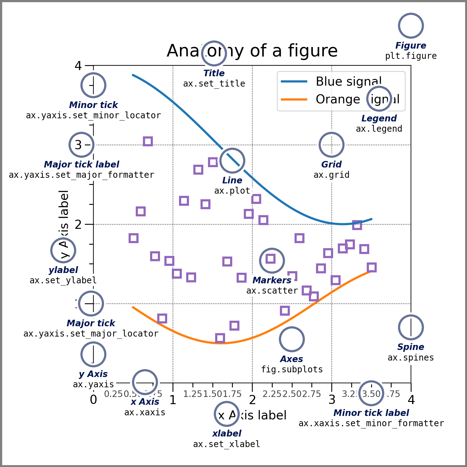
Figure:整张图形
Figure 表示整张图。它管理所有子 Axes、一组特殊的 Artist 对象,例如标题、整图图例和颜色条,也能管理嵌套的子图形。
通常可通过以下函数之一创建 Figure:
fig = plt.figure()             # an empty figure with no Axes
fig, ax = plt.subplots()       # a figure with a single Axes
fig, axs = plt.subplots(2, 2)  # a figure with a 2x2 grid of Axes
# a figure with one Axes on the left, and two on the right:
fig, axs = plt.subplot_mosaic([['left', 'right_top'],
                               ['left', 'right_bottom']])
subplots() 和 subplot_mosaic 是便利函数,创建 Figure 的同时也创建内部的 Axes;也可以先建 Figure,之后再手动添加 Axes。
有关 Figure、平移和缩放等内容,详见 Figure 入门。
Axes:绘图区
Axes 是附属于 Figure 的 Artist,包含用于绘制数据的区域。它通常有两个 Axis 对象,三维情况下为三个。注意 Axes 与 Axis 的区别:Axis 提供刻度和刻度标签,用来表示 Axes 内数据的标度。
每个 Axes 还有一个标题,通过 set_title() 设置;一个 x 轴标签,通过 set_xlabel() 设置;以及一个 y 轴标签,通过 set_ylabel() 设置。
Axes 方法是配置图形大部分内容的主要接口,包括添加数据、控制坐标轴标度和范围,以及添加标签等。
Axis:坐标轴
Axis 对象负责设置标度与范围,生成刻度线和刻度标签。刻度线的位置由 Locator 对象决定,标签文本由 Formatter 格式化。恰当地组合 Locator 和 Formatter,可以非常精细地控制刻度位置与标签。
Artist:图形元素
基本上,Figure 中所有可见内容都是 Artist,甚至 Figure、Axes 和 Axis 本身也属于 Artist。其他例子包括 Text、Line2D、collections 和 Patch 等对象。
渲染 Figure 时,所有 Artist 都会被绘制到画布上。多数 Artist 绑定在一个 Axes 上,不能由多个 Axes 共享,也不能从一个 Axes 移到另一个 Axes。
绘图函数接受哪些输入
绘图函数期望输入 numpy.array、numpy.ma.masked_array,或者能传给 numpy.asarray 的对象。pandas 数据对象和 numpy.matrix 等类数组对象不一定会按预期工作。通常应在绘图前将它们转换为 NumPy 数组。例如,将 numpy.matrix 转为数组:
b = np.matrix([[1, 2], [3, 4]])
b_asarray = np.asarray(b)
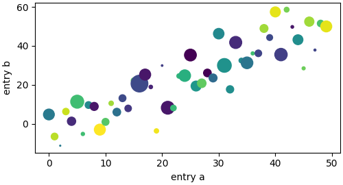
多数绘图方法还支持能用字符串索引的对象,例如字典、结构化 NumPy 数组或 pandas.DataFrame。将对象传给 data 关键字参数后,可以用对应 x、y 变量的字符串名称绘图:
np.random.seed(19680801)  # seed the random number generator.
data = {'a': np.arange(50),
        'c': np.random.randint(0, 50, 50),
        'd': np.random.randn(50)}
data['b'] = data['a'] + 10 * np.random.randn(50)
data['d'] = np.abs(data['d']) * 100

fig, ax = plt.subplots(figsize=(5, 2.7), layout='constrained')
ax.scatter('a', 'b', c='c', s='d', data=data)
ax.set_xlabel('entry a')
ax.set_ylabel('entry b')
编码风格
显式接口与隐式接口
使用 Matplotlib 主要有两种方式:
- 显式创建 Figure 和 Axes,并调用这些对象上的方法,即面向对象风格,简称 OO 风格。
- 由 pyplot 隐式创建、管理 Figure 和 Axes,并通过 pyplot 函数绘图。
两种接口的取舍见 Matplotlib 应用接口说明。
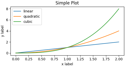
面向对象风格示例:
x = np.linspace(0, 2, 100)  # Sample data.

# Note that even in the OO-style, we use `.pyplot.figure` to create the Figure.
fig, ax = plt.subplots(figsize=(5, 2.7), layout='constrained')
ax.plot(x, x, label='linear')  # Plot some data on the Axes.
ax.plot(x, x**2, label='quadratic')  # Plot more data on the Axes...
ax.plot(x, x**3, label='cubic')  # ... and some more.
ax.set_xlabel('x label')  # Add an x-label to the Axes.
ax.set_ylabel('y label')  # Add a y-label to the Axes.
ax.set_title("Simple Plot")  # Add a title to the Axes.
ax.legend()  # Add a legend.
相同图形也可以用 pyplot 风格绘制:
x = np.linspace(0, 2, 100)  # Sample data.

plt.figure(figsize=(5, 2.7), layout='constrained')
plt.plot(x, x, label='linear')  # Plot some data on the (implicit) Axes.
plt.plot(x, x**2, label='quadratic')  # etc.
plt.plot(x, x**3, label='cubic')
plt.xlabel('x label')
plt.ylabel('y label')
plt.title("Simple Plot")
plt.legend()
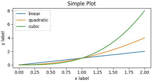
还有第三种方式,适用于将 Matplotlib 嵌入 GUI 应用:完全不用 pyplot,连 Figure 也直接创建。详情见在图形用户界面中嵌入 Matplotlib。
Matplotlib 文档和示例同时使用 OO 与 pyplot 风格。通常推荐 OO 风格,尤其是在绘制复杂图形,或编写将被大型项目复用的函数、脚本时。快速进行交互式探索时,pyplot 则很方便。
注意:一些旧示例通过 from pylab import * 使用 pylab 接口。这种做法已经被强烈弃用。
创建辅助函数
如果需要对不同数据集反复绘制同一种图,或者希望方便地封装 Matplotlib 方法,可以采用以下推荐的函数签名:
def my_plotter(ax, data1, data2, param_dict):
    """
    A helper function to make a graph.
    """
    out = ax.plot(data1, data2, **param_dict)
    return out
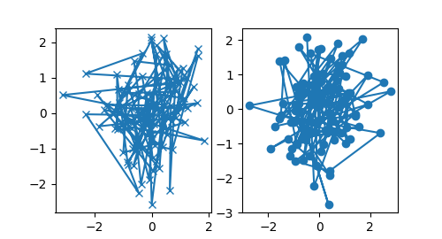
然后调用两次,分别填充两个子图:
data1, data2, data3, data4 = np.random.randn(4, 100)  # make 4 random data sets
fig, (ax1, ax2) = plt.subplots(1, 2, figsize=(5, 2.7))
my_plotter(ax1, data1, data2, {'marker': 'x'})
my_plotter(ax2, data3, data4, {'marker': 'o'})
如需把辅助函数或其他自定义内容安装为 Python 包,可以使用网上的项目模板。Matplotlib 提供了 mpl-cookiecutter。
设置 Artist 样式
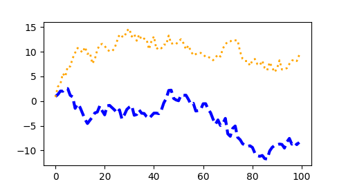
多数绘图方法都提供 Artist 的样式选项。既可以在调用绘图方法时指定,也可以之后调用 Artist 的设置方法。下面的示例为 plot 创建的对象手动设置颜色、线宽和线型,并在创建第二条线后用 set_linestyle 修改其线型:
fig, ax = plt.subplots(figsize=(5, 2.7))
x = np.arange(len(data1))
ax.plot(x, np.cumsum(data1), color='blue', linewidth=3, linestyle='--')
l, = ax.plot(x, np.cumsum(data2), color='orange', linewidth=2)
l.set_linestyle(':')
颜色
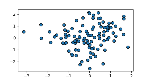
大多数 Artist 接受多种灵活的颜色表示方式,详见允许的颜色定义。一些 Artist 可以使用多种颜色。例如,散点图的标记边缘与内部可以分别着色:
fig, ax = plt.subplots(figsize=(5, 2.7))
ax.scatter(data1, data2, s=50, facecolor='C0', edgecolor='k')
线宽、线型与标记大小
具有描边的 Artist 可以设置线宽,单位通常为排版点,1 pt 等于 1/72 英寸。描边也可设置线型,参见线型示例。
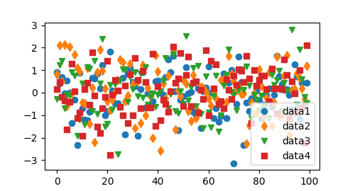
标记大小的含义取决于所用方法。plot 的 markersize 以点为单位,通常表示标记的直径或宽度;scatter 的大小参数则与标记的视觉面积近似成正比。
可以用字符串代码指定多种标记样式,也可以自行定义 MarkerStyle。参见标记参考。
fig, ax = plt.subplots(figsize=(5, 2.7))
ax.plot(data1, 'o', label='data1')
ax.plot(data2, 'd', label='data2')
ax.plot(data3, 'v', label='data3')
ax.plot(data4, 's', label='data4')
ax.legend()
为图形添加文字
坐标轴标签与文本
set_xlabel、set_ylabel 和 set_title 分别在相应位置添加文字,更多说明见 Matplotlib 中的文本。也可以通过 text 在图内直接放置文本:
mu, sigma = 115, 15
x = mu + sigma * np.random.randn(10000)
fig, ax = plt.subplots(figsize=(5, 2.7), layout='constrained')
# the histogram of the data
n, bins, patches = ax.hist(x, 50, density=True, facecolor='C0', alpha=0.75)

ax.set_xlabel('Length [cm]')
ax.set_ylabel('Probability')
ax.set_title('Aardvark lengths\n (not really)')
ax.text(75, .025, r'$\mu=115,\ \sigma=15$')
ax.axis([55, 175, 0, 0.03])
ax.grid(True)
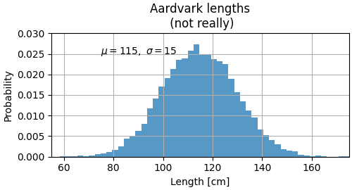
所有文本函数都会返回一个 matplotlib.text.Text 实例。与前面的线条一样,可以向文本函数传入关键字参数,自定义对象属性:
t = ax.set_xlabel('my data', fontsize=14, color='red')
详细说明见文本属性与布局。
在文字中使用数学表达式
Matplotlib 接受在文本中使用 TeX 数学表达式。例如,要在标题中写出 σᵢ = 15,可以将 TeX 表达式放在美元符号之间:
ax.set_title(r'$\sigma_i=15$')
标题字符串前的 r 表示原始字符串,避免 Python 将反斜杠解释为转义序列。Matplotlib 内置 TeX 表达式解析器、排版引擎及数学字体,详见编写数学表达式。也可以直接使用 LaTeX 排版文字,并将结果显示在图形中或写入 PostScript,参见使用 LaTeX 渲染文字。
标注
可以为图中的点添加标注,常见做法是把位于 xytext 的文字,用箭头连接到 xy 指定的数据点:
fig, ax = plt.subplots(figsize=(5, 2.7))

t = np.arange(0.0, 5.0, 0.01)
s = np.cos(2 * np.pi * t)
line, = ax.plot(t, s, lw=2)

ax.annotate('local max', xy=(2, 1), xytext=(3, 1.5),
            arrowprops=dict(facecolor='black', shrink=0.05))

ax.set_ylim(-2, 2)
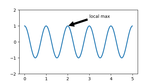
这个基础示例中的 xy 与 xytext 都使用数据坐标。Matplotlib 还支持多种其他坐标系,详见基础与高级标注及标注示例。
图例
通常可以通过 Axes.legend 标识各条线或各组标记:
fig, ax = plt.subplots(figsize=(5, 2.7))
ax.plot(np.arange(len(data1)), data1, label='data1')
ax.plot(np.arange(len(data2)), data2, label='data2')
ax.plot(np.arange(len(data3)), data3, 'd', label='data3')
ax.legend()
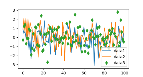
Matplotlib 图例在布局、位置以及可表示的 Artist 类型方面都非常灵活,详见图例指南。
坐标轴标度与刻度
每个 Axes 包含两个或三个 Axis 对象,代表 x、y 等坐标轴。这些对象控制坐标轴标度、刻度定位器和刻度格式器。还可以附加额外的 Axes,以显示更多坐标轴。
标度
除了线性标度,Matplotlib 还提供对数等非线性标度。由于对数标度非常常用,还提供了 loglog、semilogx 和 semilogy 等直接绘图方法。更多例子见标度概览。下面手动设置标度:
fig, axs = plt.subplots(1, 2, figsize=(5, 2.7), layout='constrained')
xdata = np.arange(len(data1))  # make an ordinal for this
data = 10**data1
axs[0].plot(xdata, data)

axs[1].set_yscale('log')
axs[1].plot(xdata, data)
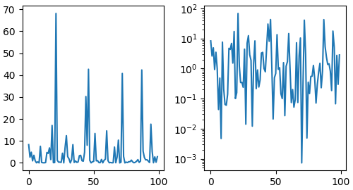
标度决定数据值如何映射为坐标轴上的间距。这种映射在两个方向上发生,并组合成变换。Matplotlib 正是通过变换,将数据坐标映射到 Axes、Figure 或屏幕坐标。详见变换教程。
刻度定位器与格式器
每个 Axis 都有定位器和格式器,分别控制刻度位置和显示文本。一个简单接口是 set_xticks:
fig, axs = plt.subplots(2, 1, layout='constrained')
axs[0].plot(xdata, data1)
axs[0].set_title('Automatic ticks')

axs[1].plot(xdata, data1)
axs[1].set_xticks(np.arange(0, 100, 30), ['zero', '30', 'sixty', '90'])
axs[1].set_yticks([-1.5, 0, 1.5])  # note that we don't need to specify labels
axs[1].set_title('Manual ticks')
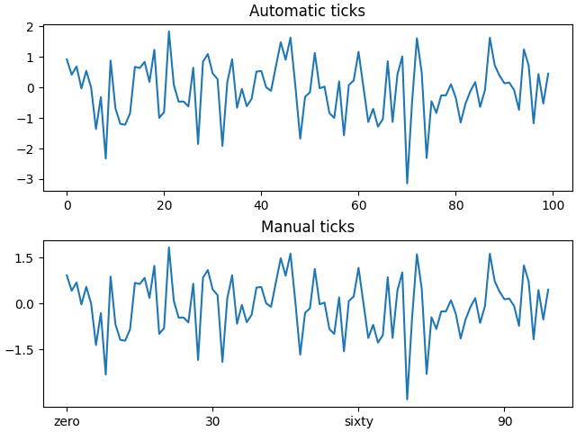
不同标度可以配合不同的定位器和格式器。例如,上面的对数标度使用 LogLocator 与 LogFormatter。更多内置选择和自定义方法见刻度定位器及刻度格式器。
绘制日期与字符串
除了浮点数,Matplotlib 也能绘制日期数组和字符串数组,并按数据类型选择合适的定位器与格式器。日期示例:
from matplotlib.dates import ConciseDateFormatter

fig, ax = plt.subplots(figsize=(5, 2.7), layout='constrained')
dates = np.arange(np.datetime64('2021-11-15'), np.datetime64('2021-12-25'),
                  np.timedelta64(1, 'h'))
data = np.cumsum(np.random.randn(len(dates)))
ax.plot(dates, data)
ax.xaxis.set_major_formatter(ConciseDateFormatter(ax.xaxis.get_major_locator()))
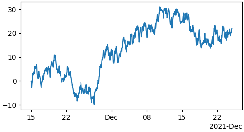
更多示例见日期刻度标签。
字符串会得到分类图,参见绘制分类变量:
fig, ax = plt.subplots(figsize=(5, 2.7), layout='constrained')
categories = ['turnips', 'rutabaga', 'cucumber', 'pumpkins']

ax.bar(categories, np.random.rand(len(categories)))
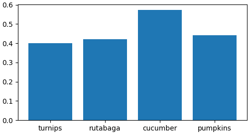
分类图有一个常见陷阱:有些文本解析方法返回字符串列表,即使字符串的内容全是数字或日期。如果传入 1000 个字符串,Matplotlib 会认为有 1000 个类别,于是在图中添加 1000 个刻度。
添加额外坐标轴
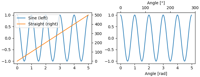
同一张图包含不同数量级的数据时,可能需要额外的 y 轴。使用 twinx 可以添加一个新的 Axes,其 x 轴不可见,y 轴位于右侧;twiny 的行为与之对应。另见不同标度的绘图示例。
同样,可以添加 secondary_xaxis 或 secondary_yaxis,使其采用不同于主坐标轴的标度,用其他尺度或单位表示数据。详见次坐标轴。
fig, (ax1, ax3) = plt.subplots(1, 2, figsize=(7, 2.7), layout='constrained')
l1, = ax1.plot(t, s)
ax2 = ax1.twinx()
l2, = ax2.plot(t, range(len(t)), 'C1')
ax2.legend([l1, l2], ['Sine (left)', 'Straight (right)'])

ax3.plot(t, s)
ax3.set_xlabel('Angle [rad]')
ax4 = ax3.secondary_xaxis('top', (np.rad2deg, np.deg2rad))
ax4.set_xlabel('Angle [°]')
用颜色表示数据
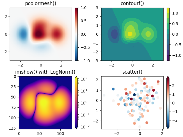
经常需要通过颜色映射表示第三个数据维度。Matplotlib 提供多种支持这种表达方式的图形:
from matplotlib.colors import LogNorm

X, Y = np.meshgrid(np.linspace(-3, 3, 128), np.linspace(-3, 3, 128))
Z = (1 - X/2 + X**5 + Y**3) * np.exp(-X**2 - Y**2)

fig, axs = plt.subplots(2, 2, layout='constrained')
pc = axs[0, 0].pcolormesh(X, Y, Z, vmin=-1, vmax=1, cmap='RdBu_r')
fig.colorbar(pc, ax=axs[0, 0])
axs[0, 0].set_title('pcolormesh()')

co = axs[0, 1].contourf(X, Y, Z, levels=np.linspace(-1.25, 1.25, 11))
fig.colorbar(co, ax=axs[0, 1])
axs[0, 1].set_title('contourf()')

pc = axs[1, 0].imshow(Z**2 * 100, cmap='plasma', norm=LogNorm(vmin=0.01, vmax=100))
fig.colorbar(pc, ax=axs[1, 0], extend='both')
axs[1, 0].set_title('imshow() with LogNorm()')

pc = axs[1, 1].scatter(data1, data2, c=data3, cmap='RdBu_r')
fig.colorbar(pc, ax=axs[1, 1], extend='both')
axs[1, 1].set_title('scatter()')
颜色映射
以上都是派生自 ScalarMappable 的 Artist。它们可以将 vmin 到 vmax 之间的数据线性映射到 cmap 指定的颜色表。Matplotlib 内置很多颜色表,参见选择颜色映射;也可以创建自己的颜色表,或安装第三方颜色包。
归一化
有时需要将数据非线性地映射到颜色表,例如上面的 LogNorm 示例。此时向 ScalarMappable 传入 norm,替代 vmin 和 vmax。更多方式见颜色映射归一化。
颜色条
添加 colorbar 可以提供颜色与数据值之间的对应关系。颜色条是 Figure 层级的 Artist,绑定到一个 ScalarMappable,从中获得归一化方式与颜色表的信息,并且通常会占用父 Axes 的一部分空间。
颜色条的布局可能比较复杂,详见放置颜色条。可以用 extend 在颜色条末端增加箭头,用 shrink 和 aspect 控制大小。颜色条也会根据归一化方式获得默认刻度定位器与格式器,并可像其他 Axis 一样修改。
同时使用多个 Figure 与 Axes
多次调用 fig = plt.figure() 或 fig2, ax = plt.subplots(),可以打开多个 Figure。保留对象引用后,就能向任意 Figure 添加 Artist。
添加多个 Axes 有多种方法,最基本的是前面使用的 plt.subplots()。若需要某个 Axes 跨越多行或多列,可以借助 subplot_mosaic 构造更复杂的布局:
fig, axd = plt.subplot_mosaic([['upleft', 'right'],
                               ['lowleft', 'right']], layout='constrained')
axd['upleft'].set_title('upleft')
axd['lowleft'].set_title('lowleft')
axd['right'].set_title('right')
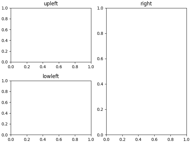
Matplotlib 提供了丰富的 Axes 排列工具,详见在 Figure 中安排多个 Axes以及复杂且有语义的图形组合。
延伸阅读与代码下载
更多图形类型见绘图类型和 API 参考,尤其是 Axes API。
原文构建记录中的脚本总运行时间为 11.005 秒,此数值来自原文示例运行记录。
原文示例库由 Sphinx-Gallery 生成。
原文来源:Quick start guide。本文依据留存原文译为中文,代码示例按原文保留。
© Copyright 2002–2012 John Hunter, Darren Dale, Eric Firing, Michael Droettboom and the Matplotlib development team; 2012–2026 The Matplotlib development team.










暂无评论内容